Blending Distress Inks To Make A Sunset
I have discovered a new love for creating backgrounds by blending Distress Inks!
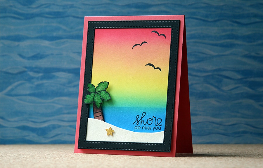
For today’s card, I used a stamp set from Paper Smooches to create a scene for my last card with a summer theme before I switch to autumn. I think the sentiment is particularly fitting 😉
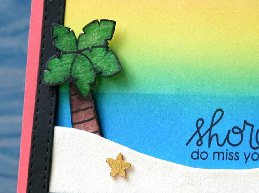
I really didn’t want to let go of the sunshine this year, but Starbucks has their Pumpkin Spice Lattes again, so it’s time to pack up the warm weather themes and start to die cut pumpkins and black cats. But – not before I fussy cut one more tiny palm tree!
To make the background on this card, get you a 4″x 5.25″ piece of smooth white cardstock and begin blending the Peacock Feathers ink up from the bottom. Keep working at it until it’s about one-third of the way up the panel, then switch to Squeezed Lemonade. The trick is to blend the yellow in from the sides to the center, then continue down into the blue.
To make the waterline like I did for the horizon, blend the yellow down into the blue just a little and then mask over the blue with tape before continuing to work on the yellow-blue blending (which turns to a beautiful green!).
Now, switch to Festive Berries and blend that color from the top of the panel down to and overlapping the yellow just a little, and you will have that beautiful orange shade where the colors meet. Pull off your tape and stamp away!
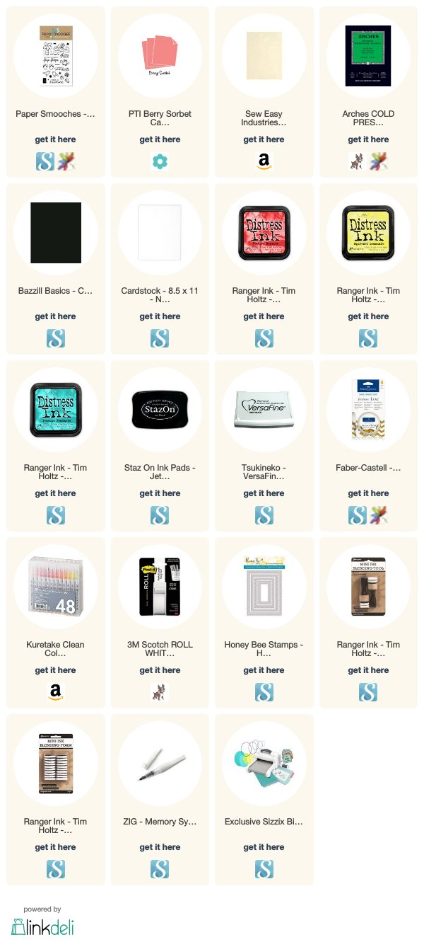
I stamped the palm tree and starfish on watercolor paper and used Clean Color brush markers to fill them in. I wanted a little more texture on the starfish, so I just touched it (literally!) with gold texture paste. The ‘sand’ is an ivory velvet paper.
To finish off my project, I used the wave images in the stamp set to make seagull silhouettes instead and stamped those and my sentiment in Versafine for a lovely dark image. I hid the edges with the black die cut frame and mounted it on my card base with foam squares.
Thanks for stopping by today! If you like this post, I’d love for you to pin it on Pinterest!
